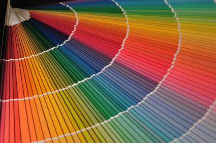
When this client’s color receptors changed as a result of a stroke, her world went gray and that loss felt devastating. Not ready to accept a world without color, I took on the challenge of this project, knowing that it was different in a lot of ways.
In addition to those accommodations needed to ensure that the space functioned for the client’s physical comfort and accessibility after a stroke, I also needed to come up with a unique design solution that would support and celebrate this woman’s deeply felt love for color. Recognizing how important the emotional connection with the space would be for her day to day living, and what a difference color made in that, I began researching, exploring and “testing” a variety of color samples with her.
It was also important to this client and her husband that the space not be garish or embarrassingly colorful. Finding a balance became the goal.
 Working together, this delightful woman and I found several vivid and deeply saturated color samples that worked. With the intensity of the color ratcheted up to a level that overcame the “graying” effects of the stroke, she could now “see” her favorite colors again.
To the rest of the world, her color choices appear bold and confident; to this client, they are a reassuring compromise and have given her back a sense of comfort, familiarity, and personal expression.
Tip: Above all, your personal space should please you. Color is a great tool for ensuring that your home is a unique reflection of YOU. Color effects mood and can provide great comfort as well as inspiration for discovering and embracing life’s new opportunities.


